Synthetic_Dataset
Pietro Franceschi
synthetic_dataset.RmdIntroduction
The objective of this document is to show how the synthetic dataset
included in the gASCA package was created. In this
simulation, 15 count variables are obtained as a function of 3 different
treatments at 5 points in time. These variables could represent, for
instance, count data from 10 different invertebrate species found on
plants at Time (A) 0, 1, 2, 3, 4 after the plants have been treated with
one of three treatments (B1, B2, B3). For each combination of time and
treatment, K = 10 replicates (k = 1…K) were simulated considering the
model:
Y = g−1(H0+HA+HB+HAB) + EPois
This is further decomposed in term-specific latent variables. A set of loadings is then used to associate each latent variable to a group of the measured variables:
Y = g−1(H0+TAPAT+TBPBT+TABPABT) + E*Poi**s*
In particular.
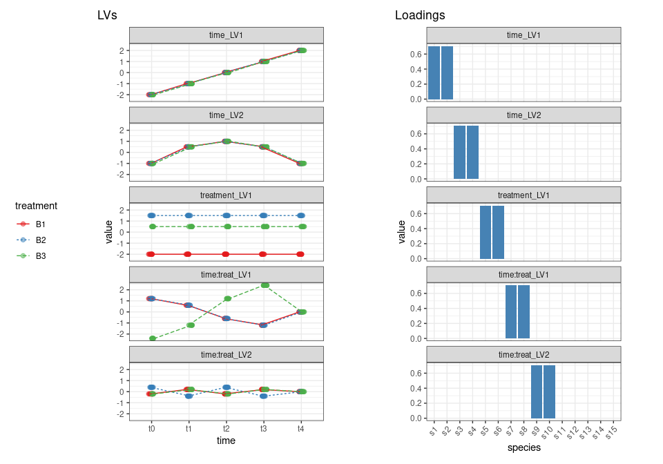
- Two principal components are used to describe the variation in matrix HA (time). The variation described by the first component is only present in the first two variables, and the variation of the second component is only present in variables 3 and 4. PC1 has a continuous upward trend in time while PC2 increases in the first three time steps and then decreases again.
- One principal component is used to describe the treatment effect in matrix HB (treatment) and this variation is only present in variables 5 and 6.
- Two components are used for the interaction effect in matrix H*A**B*: PC1 is only active in variables 7 and 8 and shows a disagreement between treatment B3 and the other two treatments, while PC2 variation, only assigned to variables 9 and 10, represents a deviation from treatment B2 compared to the other two treatments.
- Five additional variables not responding to the design are added to the dataset.
ntime <- 5   # no of timepoints
ntreat <- 3  # no of treatments
nrepl <- 10   # no of replicates

## number of samples
nSamp = ntime * ntreat * nrepl
Factor A: time
## The design a matrix for the first factor is the following
contrA <- contr.sum(ntime)

contrA
## [,1] [,2] [,3] [,4]
## 1 1 0 0 0
## 2 0 1 0 0
## 3 0 0 1 0
## 4 0 0 0 1
## 5 -1 -1 -1 -1For each time point we have to allocate three treatments and 10 replicates
## since we have to allocate for each time point three treatment levels and
## three replicates
XA <- contrA %x% rep(1,ntreat)
XA <- XA %x% rep(1,nrepl)
Let’s now plot the matrix
XA %>%
  melt() %>%
  ggplot() +
  geom_raster(aes(x = Var2, y = -Var1, fill = factor(value))) +
  scale_fill_brewer(palette = "Set1", name = "Value") +
  theme_void()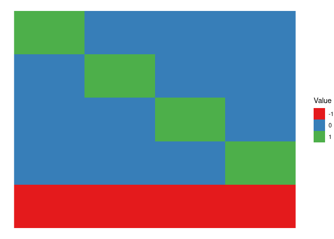
The previous design matrix is used on the two time eigentrends, which will be now organized in a matrix. Remember that since we use sum coding for the contrasts we need only four level for the 5 timepoints:
The final score matrices are obtained combining WA and XA
TA <- XA %*% WALet’s visualize the profile of the two eigentrends
TA %>%
  data.frame() %>%
  add_column(time = rep(c("t0","t1","t2","t3","t4"), each = 30)) %>%
  add_column(treatment = rep(rep(c("B1","B2","B3"), each = 10), times = 5)) %>%
  pivot_longer(contains("LV")) %>%
  ggplot() +
  geom_point(aes(x = time, y = value, col = treatment), alpha = 0.5, size = 1) +
  geom_line(aes(x = time, y = value, col = treatment, lty = treatment, group = treatment)) +
  facet_grid(treatment~name) +
  theme_bw() +
  theme(aspect.ratio = 0.5)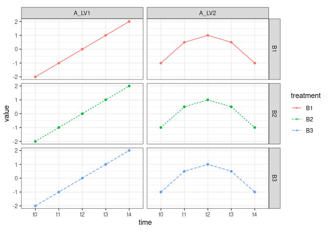
Factor B: treatment
As before we start from the design matrix with sum contrasts and 3 levels (B1,B2,B3)
contrB <- contr.sum(ntreat)
## we then have n time points and the replicates
XB <- rep(1,ntime) %x% contrB
XB = XB %x% rep(1,nrepl)
XB %>%
  melt() %>%
  ggplot() +
  geom_raster(aes(x = Var2, y = -Var1, fill = factor(value))) +
  scale_fill_brewer(palette = "Set1", name = "Value") +
  theme_void()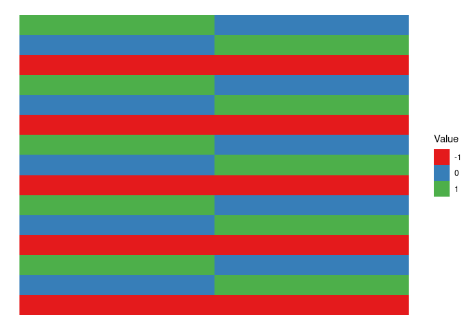
Now we define the effect of the treatment which has only one LV
## this is the effect of the treatment, only one component
WB <- c(-2, 1.5)
As before we “populate” the design matrix with the treatment levels
TB <- XB %*% WBAnd we plot the results
TB %>%
  data.frame() %>%
  add_column(time = rep(c("t0","t1","t2","t3","t4"), each = 30)) %>%
  add_column(treatment = rep(rep(c("B1","B2","B3"), each = 10), times = 5)) %>%
  ggplot() +
  geom_point(aes(x = time, y = ., col = treatment), alpha = 0.5, size = 3) +
  geom_line(aes(x = time, y = ., col = treatment, group = treatment)) +
  scale_color_brewer(palette = "Set1",  name = "Eigentrends") +
  theme_bw()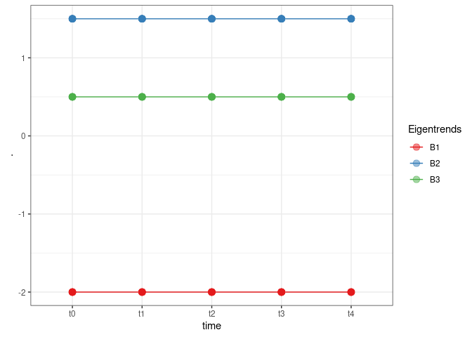
Interaction Term
The design matrix of the interaction term is obtained by a combination of XA and XB, each sample will be assigned to a combination of the levels of A and of B
## now we have the interaction term
XAB <-  cbind(XA[,1]*XB[,1],
            XA[,1]*XB[,2],
            XA[,2]*XB[,1],
            XA[,2]*XB[,2],
            XA[,3]*XB[,1],
            XA[,3]*XB[,2],
            XA[,4]*XB[,1],
            XA[,4]*XB[,2])
and this is the plot
XAB %>%
  melt() %>%
  ggplot() +
  geom_raster(aes(x = Var2, y = -Var1, fill = factor(value))) +
  scale_fill_brewer(palette = "Set1", name = "Value") +
  theme_void()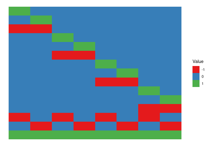
## these are the impact of the interaction on the two  components
AB_LV1 <-  3*c(0.4, 0.4, 0.2, 0.2, -0.2, -0.2, -0.4, -0.4)
AB_LV2 <-  c(-0.2,0.4, 0.2, -0.4, -0.2, 0.4, 0.2, -0.4)
WAB <- cbind(AB_LV1, AB_LV2)
TAB <- XAB%*%WAB
TAB %>%
  data.frame() %>%
  add_column(time = rep(c("t0","t1","t2","t3","t4"), each = 30)) %>%
  add_column(treatment = rep(rep(c("B1","B2","B3"), each = 10), times = 5)) %>%
  pivot_longer(contains("LV")) %>%
  ggplot() +
  #geom_point(aes(x = time, y = value, col = treatment), alpha = 0.5, size = 3) +
  geom_point(aes(x = time, y = value, col = treatment), alpha = 0.5, size = 3,
             position=position_jitterdodge(dodge.width = 0.1, jitter.width = 0.1)) +

  geom_line(aes(x = time, y = value, col = treatment, lty = treatment, group = treatment),
            position=position_jitterdodge(dodge.width = 0.1, jitter.width = 0.1) ) +
  facet_wrap(~name) +
  scale_fill_brewer(palette = "Set1",  name = "Eigentrends") +
  xlab("Sample Index") +
  theme_bw() +
  theme(aspect.ratio = 0.5)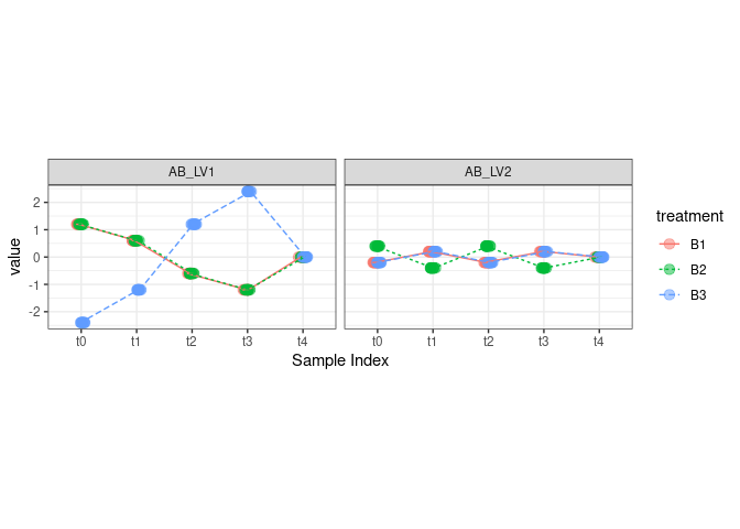
According to the initial plan, LV1 reflects a temporal change in the difference between treatment B3 and the other treatments; LV2, instead, reflects a difference between B2 and the other two treatments which changes with time.
Project on the species
Now we will use a set of loadings to associate the LV of each term to the 10 measured species. The loadings will be also normalized to 1. As discussed before, we also add 5 species which are not responding to the design.
## here we use "dummy loadings" to move from the LVs to the 15 "measured" variables

## LV1 of the time factor goes on the first two species
PA1 <- c(1, 1, 0, 0, 0, 0, 0, 0, 0, 0, 0, 0, 0, 0, 0)
PA1 <- PA1/sqrt(sum(PA1%*%PA1)) ## normalize

## LV2 of the time factor goes on s3 and s4
PA2 <- c(0, 0, 1, 1, 0, 0, 0, 0, 0, 0, 0, 0, 0, 0, 0)
PA2 <- PA2/sqrt(sum(PA2^2))

## here the loadings matrix for time
PA <- cbind(PA1, PA2)

## LV1 for the treatment factor goes to
PB <- c(0, 0, 0, 0, 1, 1, 0, 0, 0, 0, 0, 0, 0, 0, 0)
PB <- PB/sqrt(sum(PB^2))

## LV1 for the interaction goes to variables s7, s8
PAB1 <- c(0, 0, 0, 0, 0, 0, 1, 1, 0, 0, 0, 0, 0, 0, 0)
PAB1 <- PAB1/sqrt(sum(PAB1^2))
## LV2 for the interaction goes to variables s9, s10
PAB2 <- c(0, 0, 0, 0, 0, 0, 0, 0, 1, 1, 0, 0, 0, 0, 0)
PAB2 <- PAB2/sqrt(sum(PAB2^2))
PAB <- cbind(PAB1, PAB2)
Let’s plot the loadings
cbind.data.frame(PA,PB,PAB) %>%
  add_column(species = paste0("s",1:15)) %>%
  mutate(species = factor(species, levels = unique(species))) %>%
  pivot_longer(starts_with("p")) %>%
  mutate(name = factor(name, levels = c("PA1","PA2","PB","PAB1","PAB2"))) %>%
  ggplot() +
  geom_col(aes(x = species, y = value, fill = name)) +
  facet_wrap(~name, ncol = 1) +
  theme_bw() +
  theme(aspect.ratio = 0.3)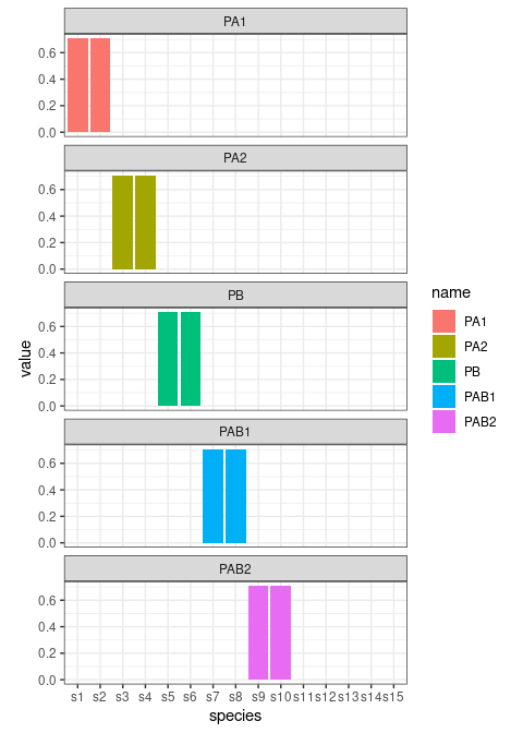
Now we create the matrices containing the expected values (remember that we are working on the linear predictor space)
To reduce the number of zeroes we create a matrix with the grand mean for the different species.
## Finally we need the grand mean
mu <- rep(1, ntreat*ntime*nrepl) %*% t(c(2, 3, 4, 5, 6, 6, 5, 4, 3, 2, 6, 5, 8, 5, 3))
Now we combine everything, back transform values in the “count” space and add poisson noise.
## we add everything up and make the inverse link
logy <- mu + A + B + AB
y <- exp(logy)

ycount <- apply(y,2, function(c) rpois(n = length(c), lambda = c))
To finish with the synthetic dataset we need to prepare the dataframe with the design.
d <- data.frame(time = rep(c("t0","t1","t2","t3","t4"), each = 30),
                treatment = rep(rep(c("B1","B2","B3"), each = 10), times = 5))
colnames(ycount) <- paste0("s",1:15)


synth_count_data <- list(counts = ycount, design = d)
Save the data in the package folder.
save(synth_count_data, file = "../../data/synth_count_data.RData", version = 2)Figures
We finally use patchwork to produce the figures for the
paper.
figure_1a <- cbind.data.frame(PA,PB,PAB) %>%
  add_column(species = paste0("s",1:15)) %>%
  mutate(species = factor(species, levels = unique(species))) %>%
  pivot_longer(starts_with("p")) %>%
  mutate(name = factor(name, levels = c("PA1","PA2","PB","PAB1","PAB2"),
                       labels = c("time_LV1", "time_LV2", "treatment_LV1",
                                  "time:treat_LV1","time:treat_LV2" ))) %>%
  ggplot() +
  geom_col(aes(x = species, y = value), fill = "steelblue") +
  facet_wrap(~name, ncol = 1) +
  ggtitle("Loadings") +
  theme_bw() +
  theme(aspect.ratio = 0.3,
        legend.position = "none",
        axis.text.x = element_text(angle = 45, vjust = 1, hjust=1))
figure_1b <- cbind.data.frame(TA,B_LV1 = TB,TAB) %>%
  add_column(time = rep(c("t0","t1","t2","t3","t4"), each = 30)) %>%
  add_column(treatment = rep(rep(c("B1","B2","B3"), each = 10), times = 5)) %>%
  pivot_longer(contains("LV")) %>%
  mutate(name = factor(name, levels = c("A_LV1","A_LV2","B_LV1","AB_LV1","AB_LV2"),
                       labels = c("time_LV1", "time_LV2", "treatment_LV1",
                                  "time:treat_LV1","time:treat_LV2" ))) %>%
  ggplot() +
  geom_point(aes(x = time, y = value, col = treatment),
             position=position_jitterdodge(dodge.width = 0.1, jitter.width = 0.1), alpha = 0.5, size = 2) +
  geom_line(aes(x = time, y = value, col = treatment, group = treatment, lty = treatment),
            position=position_jitterdodge(dodge.width = 0.1, jitter.width = 0.1)) +
  facet_wrap(~name, ncol = 1) +
  scale_color_brewer(palette = "Set1") +
  ggtitle("LVs") +
  theme_bw() +
  theme(aspect.ratio = 0.3,
        legend.position = "left")
Join the figure with patchwork
figure_1b | figure_1a